I work as a specialist for the Office of Mathematics. One day I accidentally referred to our department as the Awesome of Math rather than the Office of Math. Since then, we sometimes refer to ourselves as the “Awesome of Math.” So, when I reviewed this assignment, I thought the title would be great for a fictitious logo. I also wanted the logo to be bright and reflective of elementary math, because that is my background and passion.
I chose to create a lightbulb to represent those “lightbulb moments” of learning. I changed the transparency inside of the lightbulb and added the “rays of light” to give the effect that it is glowing. Within the lightbulb, I included the four operation symbols in bright colors. I used the calligraphy pen in Inkscape to create the symbols because I liked the way the it gave them a handwritten look. I purposefully chose the order of the symbols, starting with addition and subtraction because they are typically the first operations that students learn. I also placed multiplication below addition because multiplication is related to repeated addition. Likewise for division and repeated subtraction. I chose a bright blue for the font and outer circle because I thought that it was a great complement to the yellow lightbulb. It took me awhile to decide on a font. I eventually settled on Berlin Sans FB Demi because it was a thicker font and looked appropriate for elementary math.
The process of creating the lightbulb from scratch in Inkscape was a little tricky and a process of trial and error. I was pleased that when I resized my logo in PowerPoint, the image did not become distorted, and its quality was maintained. Overall, I am pleased with my logo and am excited to share it with the K-5 Office of Math team.
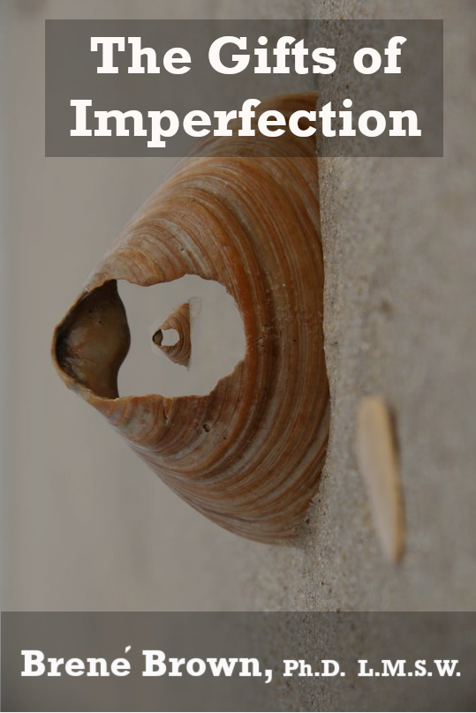
I chose to design a book cover for The Gifts of Imperfection by Brene’ Brown for a few reasons. First, I have read this book several times in the last decade and discover new takeaways each time. Also, the book was rereleased a few years ago with an updated cover that was very different from the original cover. So, I though that it might be interesting to create my own cover based on the content of the book.
I selected the broken shell image as the background, or first layer, of my cover. I chose this image because the shell is imperfect, in that it is broken, and aligns with the title of the book. I also chose this image because of its neutral color palette and pattern on the larger shell. Then I placed a smaller image of the broken shell inside of the larger shell. This is meant to represent self reflection and introspection, which are common themes in the book. For this smaller shell, I had to use the lasso tool in order to capture just the shell and not the surrounding sand. Next, I added black overlays and rectangles at various opacities to adjust the color of the images. Finally, I added the text. I chose Rockwell Bold and white for the font because I liked the way it stood out from the other layers of the cover.
Overall, I am satisfied with my book cover, though I could spend a lot more time tweaking various aspects of it. Learning to use the tools and navigate the different layers in GIMP was challenging. However, as with most things, the more I practiced the easier the process became. I liked that I was able to manipulate the different layers to customize my cover.